Project Overview
Foodie Fix is a mobile cooking application designed specifically for university students. The app simplifies recipe discovery through personalized onboarding, dietary preferences, accessibility features, and guided cooking experiences. The project focused on improving usability through multiple rounds of heuristic evaluations and user testing.
User Personas
Using insights gathered from user interviews, I developed personas that represent the primary user groups of Foodie Fix. These personas helped identify users' cooking habits, goals, pain points, and motivations, ensuring that design decisions addressed the needs of different cooking experience levels and lifestyles.

13 Weeks
TIMEFRAME
TOOLS
Google Docs, Figma, Google Forms, Zoom
MY ROLE
UX/UI Design, Visual Design, Research
Prototyping + Testing
OBJECTIVES/GOALS
The objective of this project was to design an intuitive, personalized recipe application that simplifies recipe discovery while supporting accessibility, healthy eating habits, and efficient meal preparation. Through user-centered design methods, heuristic evaluations, and iterative prototyping, our team aimed to create an experience that feels organized, welcoming, and easy to navigate from the moment a user creates an account.
Foodie Fix helps users find affordable recipes that fit their dietary needs.
THE CHALLENGE
University students often struggle to find recipes that fit their dietary restrictions, cooking experience, budget, and available time. Existing recipe platforms contain overwhelming amounts of information without personalization, making meal planning difficult. This motivated the creation of Foodie Fix, a personalized recipe platform designed around student needs.
WHY RESEARCH?
To better understand users' cooking habits and evaluate our prototype, we conducted interviews using a structured interview guide followed by a heuristic evaluation. The findings informed several iterations throughout the design process.
EMPHASIZE
Research
My Design Process
USER INTERVIEWS
To gain a deeper understanding user interviews were conducted with three university students to better understand their cooking routines, challenges when using recipe applications, and the tools they currently rely on. The interviews explored their pain points, preferences, and expectations to identify opportunities for improving the overall user experience.


How might we help students quickly discover affordable recipes that fit their budget, dietary preferences, and available ingredients?
How might we provide personalized recommendations that simplify meal planning and reduce the time users spend searching for recipes?
How might we create a cooking experience that helps beginner cooks feel more confident through intuitive guidance and step-by-step support?
How Might We
HMW
Project Goals

Before moving into ideation, we synthesized our interview findings into clear user needs and design opportunities. These insights guided the development of Foodie Fix by focusing on three primary goals:
Simplify recipe discovery through personalized search, filtering, and recommendations.
Support users throughout the cooking process with clear instructions, cooking videos, and accessible guidance.
Create an intuitive and personalized experience that accommodates different skill levels, lifestyles, and dietary preferences.
Paper Low Fidelity Prototype

Branding
The branding for Foodie Fix was designed to create a warm, inviting, and approachable experience that inspires users to enjoy cooking with confidence. The visual identity emphasizes simplicity, accessibility, and personalization, reflecting the app's mission of helping users discover recipes that suit their tastes, dietary needs, and lifestyles. The vibrant visuals, clean interface, and food-focused imagery encourage exploration while making the cooking experience feel enjoyable and stress-free.
Colour Palette: Foodie Fix uses a warm and energetic palette inspired by fresh ingredients and home cooking. Vibrant orange serves as the primary accent colour, representing energy, creativity, and appetite, while white and soft neutral tones provide balance and improve readability. Subtle yellow and warm beige accents create a welcoming atmosphere that reflects comfort, freshness, and the joy of cooking. These colours help users navigate the interface easily while reinforcing a friendly and approachable brand.
Typography: A combination of bold, modern typography for headings and a clean sans-serif typeface for body text creates a clear visual hierarchy throughout the interface. The typography prioritizes readability across recipe instructions, ingredient lists, and navigation while maintaining a contemporary aesthetic. This balance allows users to quickly scan information without feeling overwhelmed.
Mood board: The mood board draws inspiration from vibrant food photography, fresh ingredients, and inviting home-cooked meals. Bright imagery, warm lighting, and clean layouts communicate feelings of comfort, creativity, and discovery. Together, these visual elements reinforce Foodie Fix's goal of making recipe discovery simple, enjoyable, and personalized for cooks of all skill levels.


Evaluation Tasks
Task 1: Navigate through the onboarding process and create an account.
Task 2: Search for a recipe and apply dietary filters.
Task 3: Save a recipe and access it later from your profile.
Metrics Reviewed
Severity Rating: Each usability issue was rated based on its impact on the user experience.
Frequency: How often the issue appeared throughout the interface.
Consistency: Whether similar components behaved consistently across screens.
User Control & Freedom: Whether users could easily undo actions or navigate freely.
Visibility of System Status: Whether users always understood what was happening within the app.
Success Criteria
Major heuristic violations are eliminated or reduced.
Navigation is clear and consistent throughout the application.
Users can complete common tasks with minimal confusion.
Interface elements follow established design conventions.
The heuristic evaluation identified several opportunities to improve usability. Most issues related to consistency, visibility of system status, and user guidance. Design revisions focused on making navigation clearer, improving feedback after user actions, and providing additional contextual information throughout the experience.
Results

Original

Revise
The login experience was redesigned to create a stronger first impression and improve usability. We introduced branded imagery and reduced empty space to create a more engaging interface while increasing the size of key elements for better readability and easier interaction on mobile devices. Password visibility was added to improve usability and security, and the "Sign Up" prompt was made more prominent to encourage account creation. Hover states were also removed to better align with mobile interaction patterns.
Original

Revise

The sign-up flow was redesigned to create a more consistent and intuitive experience. Interactive elements were aligned across each screen, allowing users to build familiarity as they progressed. We also introduced dedicated back navigation, giving users greater control to revisit previous steps without restarting the onboarding process.
Original
Revise

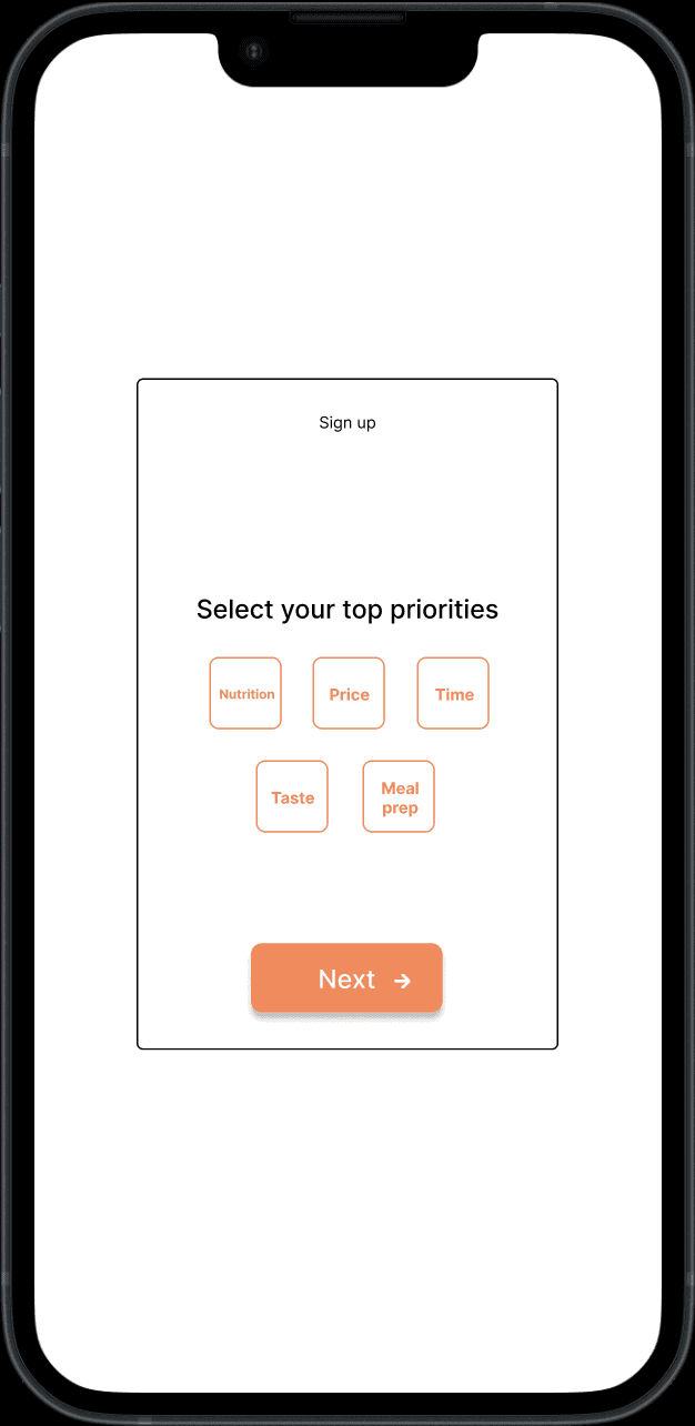
The onboarding questionnaire was refined to improve clarity and personalization. Single- and multi-select questions were visually distinguished, reducing ambiguity and making interactions more intuitive. Priority selection was redesigned into a ranking task, giving users greater control over their preferences while providing more meaningful data for personalized recipe recommendations.
Original

Revise

Navigation was simplified by replacing the side menu with a permanent bottom navigation bar, making core features easier to access. A bookmarks tab and recently viewed section were added to help users quickly return to saved and previously viewed recipes. Categories were also redesigned as filter chips, giving users greater control over browsing while supporting a more flexible scrolling experie
Original

Revise

The search experience was improved by introducing a search history pop-up and visible filter indicators. Users can quickly revisit previous searches while easily seeing which dietary filters are active, making recipe discovery faster and more personalized.
Original

Revise
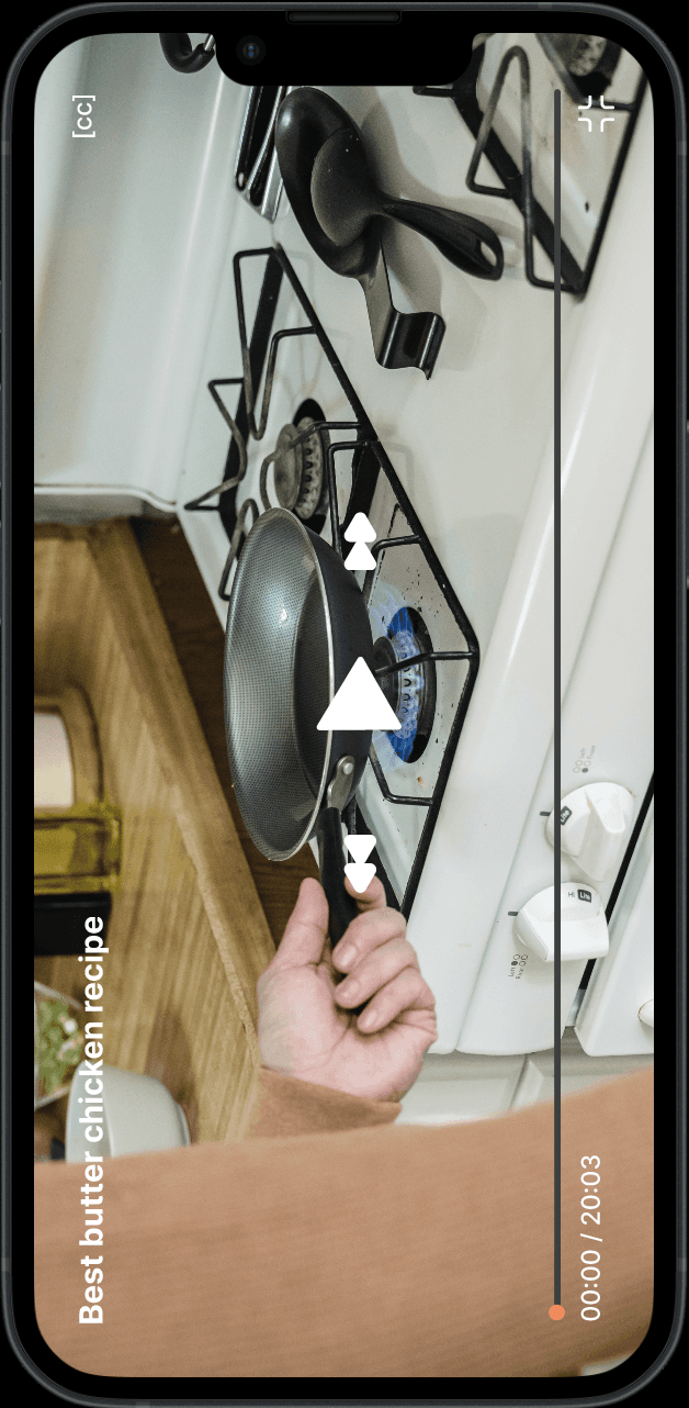
The video player was redesigned to give users greater control while cooking. Forward and rewind controls were added, allowing users to quickly skip through recipe videos without losing their place. This creates a more flexible and user-friendly cooking experience.
Original

Revise
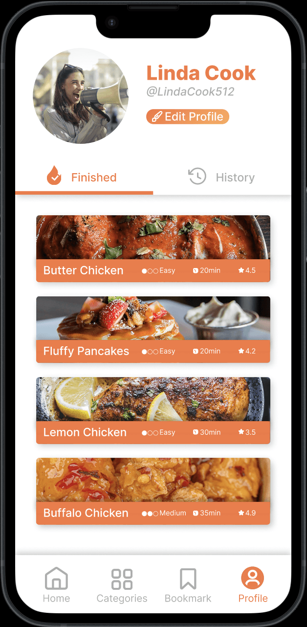
To encourage continuous improvement, a recipe rating feature was introduced so users can provide feedback after cooking. The profile page was also expanded to include completed and viewed recipes, making it easier for users to track their progress and revisit favourite meals.

Key Questions
What are the biggest difficulties you experience when using food or recipe apps?
Which features (e.g., recipe search, cooking videos, and bookmarks) would users find most valuable in a cooking app
What tools and resources do users currently utilize to learn how to cook, and what limitations do these have?
This is what I found:
Current Cooking Resources and Their Limitations
Many participants rely on Google, YouTube, TikTok, and existing recipe apps to learn how to cook. While these platforms provide a large variety of recipes, users often find it difficult to discover meals that match their dietary preferences, available ingredients, or cooking skill level. The abundance of options can also make recipe selection overwhelming, highlighting the need for a more personalized and efficient cooking experience.
Challenges in Finding and Preparing Recipes
Participants frequently described difficulties when using recipe applications, including excessive scrolling, overwhelming recipe choices, and time consuming search processes. Many users struggled to quickly locate recipes that fit their needs and found navigation between screens confusing. These findings emphasize the importance of simplifying recipe discovery and creating a more intuitive user experience that reduces effort during meal planning.
Interest in Personalized Cooking Features
There was a strong interest in features that make cooking easier and more enjoyable. Participants expressed a preference for advanced recipe search, personalized recommendations, step by step cooking videos, recipe bookmarking, and ingredient based filtering. These features were seen as valuable tools for saving time, improving confidence while cooking, and creating a more personalized experience that adapts to individual preferences and lifestyles.
Budget-conscious students need an affordable and efficient way to discover recipes that match their budget, available ingredients, and busy schedules so they can cook healthy meals with confidence.
Health-conscious young professionals need personalized recipe recommendations and meal-planning tools that reduce the time spent searching for recipes while supporting their dietary goals.
Beginner cooks need simple, guided cooking experiences with step-by-step instructions and visual tutorials that make learning new recipes less intimidating and more enjoyable.
Points of View
POV
Heuristic Evaluation
I conducted a heuristic evaluation of the Foodie Fix prototype using Nielsen's 10 Usability Heuristics. Three evaluators independently reviewed the interface to identify usability issues related to recipe discovery, navigation, consistency, visibility of system status, and user control. After the evaluations, the findings were consolidated and prioritized based on severity before iterating on the design.
3 Major Issues
4 Minor Issues
Heuristic Findings
The login and onboarding screens lacked clear guidance for first-time users.
Recipe filters were not immediately noticeable, making recipe discovery more difficult.
Navigation labels and icons could be more consistent across the application.
Designing Foodie Fix reinforced the importance of creating user-centered experiences through research, iteration, and continuous evaluation. By combining user interviews, persona development, heuristic evaluations, and iterative prototyping, the project evolved into a solution that makes recipe discovery more accessible, personalized, and enjoyable for university students and beginner cooks.
The heuristic evaluation played a key role in identifying usability issues early in the design process, allowing improvements to navigation, onboarding, search functionality, and overall interface consistency before finalizing the prototype. Each design iteration was guided by established UX principles to ensure the experience remained intuitive and efficient.
Moving forward, Foodie Fix has the potential to expand through AI-powered recipe recommendations, meal planning, grocery list integration, nutritional tracking, and community features that encourage users to share recipes and cooking experiences. These future enhancements would further support users in building confidence in the kitchen while creating a more personalized and engaging cooking journey.
Overall, this project demonstrates how thoughtful research, evidence-based design decisions, and iterative refinement can transform user insights into a practical solution that encourages healthier, more enjoyable, and more confident cooking experiences.
Final Conclusion
High Fidelity Wireframes
After establishing the visual identity for Foodie Fix, I designed high-fidelity screens and developed an interactive prototype to evaluate the user experience. This allowed me to conduct usability testing, gather user feedback, and refine the design through multiple iterations.
UX/UI Design, Product Design, Visual Design
Making Home Cooking Easier with a Personalized Recipe Experience